Introduction
A mobile menu is very important for every WordPress website. Most visitors now browse websites from mobile phones and tablets. They need a clear menu to move through your website. If the menu is missing, visitors may feel confused quickly. They may not find your services, products, blog, or contact page. This can reduce trust and affect your website results.
Many website owners notice this issue on mobile devices only. The desktop menu may work fine without any visible problem. However, the WordPress mobile menu not showing an issue can appear suddenly. It may happen after a theme update, plugin update, cache change, or layout edit. In some cases, the hamburger icon is missing from the screen. In other cases, the icon appears but does not open.
The good news is that this issue can often be fixed. You do not always need a full website redesign. You only need to check the right settings step by step. This guide will help you understand the issue clearly. It will also explain the common reasons behind it.
What Does “Missing Mobile Menu in WordPress” Error Mean?
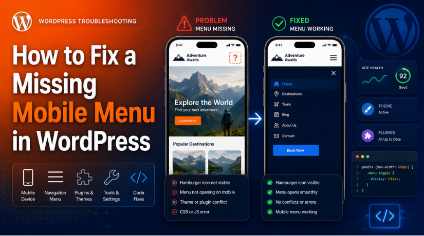
The missing mobile menu in WordPress is usually not a direct error message. WordPress may not show any warning on the dashboard. Instead, the issue appears on the front end of the website. It means the mobile menu WordPress visitors need is hidden, missing, blank, or not working.
In many cases, the menu works properly on desktop devices. However, it does not show correctly on mobile screens. This can happen because mobile menus often use different settings. A theme may use one menu for desktop and another for mobile. If the mobile menu location is empty, the menu may not appear.
The issue can also affect the hamburger menu icon. This is the small icon with three lines. Visitors tap it to open the mobile menu. Sometimes, this icon is completely missing from the header. Sometimes, it is visible but does nothing when tapped. This is a common sign of a WordPress mobile menu not working issue.
Some websites show a blank menu after clicking the icon. Other websites show only a few menu links. Dropdown items may also stop working on touch screens. In some cases, the menu works inside the editor. But it does not work on a real mobile device. It may also work for logged-in admins, but not for normal visitors.
Reasons Why WordPress Mobile Menu is Missing On the Website
There are several reasons behind a WordPress mobile menu not showing an issue. Some reasons are simple and easy to fix. Others may need deeper themes, plugins, or code checks. Understanding the cause helps you choose the right fix.
Wrong menu location is selected in WordPress
Many WordPress themes use more than one menu location. These locations may include primary menu, header menu, footer menu, and mobile menu. Some themes also use off-canvas menus or responsive menu locations. If the wrong location is selected, the desktop menu may still appear. However, the mobile menu may stay empty or hidden.
Navigation block is missing in block themes
Modern block themes use the Site Editor for many layout parts. The header may include a Navigation block for menu links. If this block is removed, the menu may disappear completely. This can affect both desktop and mobile navigation areas. However, mobile users may notice the issue more quickly.
Mobile navigation overlay is not set properly
Some newer WordPress themes use a mobile navigation overlay. This overlay opens when users tap the hamburger icon. If the overlay is empty, users may see a blank menu. If it is hidden, the menu may not open at all. This can make the WordPress mobile menu not working issue harder to understand.
The theme mobile header is disabled
Many popular themes have separate desktop and mobile header settings. These settings control how the header looks on small screens. If the mobile header is disabled, the hamburger icon may vanish. Some themes also need a mobile menu assigned separately. If that field is empty, the mobile menu may not show.
Elementor responsive settings are hiding the menu
Elementor allows users to hide sections on different devices. A menu widget may be hidden on mobile by mistake. Sometimes, the parent section or container is hidden instead. In that case, the menu widget cannot appear on phones. Display conditions can also affect where the header appears.
Cache or minification is breaking the mobile menu
Cache helps websites load faster, but it can also cause problems. Old cache files may show an outdated header on mobile. Minified CSS or JavaScript can also break menu behavior. If menu scripts load late, the hamburger icon may not open. This often causes WordPress mobile menu not working problems after optimization changes.
Custom CSS is hiding the mobile menu
Custom CSS can control how menus appear on mobile screens. A small CSS rule may hide the navigation by mistake. It may use display none, visibility hidden, or low opacity. A wrong media query can also affect only mobile devices.
Plugin conflict is stopping the menu from working
Plugins can also affect the WordPress responsive menu. Cache plugins, popup plugins, security plugins, and mega menu plugins may create conflicts. Some plugins change scripts, styles, or header behavior. When this happens, the mobile menu may stop opening. The issue may start after installing or updating one plugin.
Precautions Before Start Fixing the Missing Mobile Menu Error
Before you start fixing the issue, take a few safe steps. These steps help protect your website from extra problems.
Take a full website backup before making changes
Always take a full website backup before making any changes. Your backup should include website files and databases. This helps you restore the site if needed. Use your hosting backup tool or a trusted plugin. This step is important before editing themes, plugins, cache, or custom CSS.
Test the issue on a real mobile device
Do not depend only on desktop responsive preview. The website may look fine in the editor. Still, it may not work on a real phone. Test the mobile menu WordPress users actually see. Open the website on Android and iPhone if possible.
Check logged-in and logged-out website views
Your website may look different when you are logged in. Admin users may see fresh changes before normal visitors. Visitors may still see an old cached version. So, log out and test the website again. If the WordPress mobile menu not working issue appears only for visitors, cache may be the reason.
Note recent website changes before fixing
Think about what changed before the issue started. Check recent WordPress, theme, plugin, or Elementor updates. Also review any header edits or new custom CSS. Cache plugin, CDN, or Cloudflare changes can also matter. If the issue started after one change, review it first.
Use a staging site for major testing
A staging site is a safe copy of your website. You can test changes without affecting live visitors. This is useful when disabling plugins or testing code. It also helps when checking theme or header settings. To fix the missing mobile menu in WordPress safely, use staging when possible.
How to Solve the WordPress Mobile Menu Missing Issue
You can fix a missing mobile menu in WordPress by checking simple settings first. Do not start with code or advanced changes. In most cases, cache, theme settings, or menu locations cause the issue. Follow each step by step process carefully.
Step 1: Clear all website cache first
- Clear your browser cache on your mobile phone.
- Clear your WordPress cache plugin from the dashboard.
- Clear your hosting cache if your host provides it.
- Clear Cloudflare or CDN cache if you use one.
- Regenerate Elementor CSS and data if Elementor is active.
- Open your website in private or incognito mode.
- Check if the WordPress responsive menu appears again.
- If it appears, the issue was cache related.
Step 2: Check the correct menu location
- Go to your WordPress dashboard.
- Open Appearance and then click Menus.
- Select your main website menu from the list.
- Scroll down to the Menu Settings area. Check if the correct menu location is selected.
- Look for Primary Menu, Header Menu, or Mobile Menu.
- Also check Off Canvas Menu or Responsive Menu options.
- Select the correct mobile menu location.
- Save the menu and test it on a real phone.
Step 3: Check the Navigation block in Site Editor
- Go to your WordPress dashboard. Open Appearance and then click Editor.
- Open your Header template or header pattern.
- Check if the Navigation block is added there.
- Add a new Navigation block if it is missing.
- Select your existing menu from the block settings.
- Create a new menu if no menu is available. Add all important pages to the menu.
- Save the header and clear cache again.
- Test the WordPress mobile navigation menu on mobile.
Step 4: Check mobile overlay settings
- Open the Site Editor from your dashboard.
- Select your website header area.
- Click the Navigation block. Open the mobile or overlay menu settings.
- Check if the mobile overlay is enabled.
- Make sure menu links are added inside it.
- Check if the close button appears clearly.
- Save the changes after checking all settings.
- Test the mobile menu WordPress users can see.
- Check it on a real phone, not only preview.
Step 5: Check theme mobile header settings
- Go to Appearance and then click Customize.
- Open Header, Menu, or Mobile Header settings.
- Check if the mobile header is enabled.
- Make sure the hamburger icon is turned on.
- Check if your theme uses an off-canvas menu.
- Enable the off-canvas menu if it is disabled.
- Assign the correct menu to the mobile header.
- Save all theme settings after making changes.
- Clear your website cache and test again.
Step 6: Fix Elementor mobile menu settings
- Open your header template in Elementor.
- Select the menu widget used in the header.
- Go to the Advanced tab. Open the Responsive settings section.
- Make sure Hide on Mobile is not enabled.
- Check the parent section, column, or container.
- Make sure the parent area is visible on mobile.
- Check Elementor Theme Builder display conditions.
- Go to Elementor > Tools from the dashboard.
- Click Regenerate CSS & Data. Clear cache and test the menu again.
Step 7: Disable plugin conflicts safely
- Disable cache and speed optimization plugins first.
- Clear cache and test the mobile menu again.
- Check if the WordPress mobile menu not working issue is fixed.
- If fixed, review the plugin settings carefully.
- Check JavaScript delay, minify, and combine settings.
- If not fixed, disable other plugins one by one.
- Test the website after disabling each plugin.
- Find the plugin causing the menu conflict.
- Re-enable safe plugins after completing the test.
- Use a staging site if your website gets traffic.
Step 8: Check JavaScript errors
- Open your website in Google Chrome on the desktop.
- Right-click on the page and click Inspect. Open the Console tab from developer tools.
- Refresh the page and check for red errors.
- These errors may come from plugins or theme scripts.
- Check if the hamburger icon responds on mobile preview.
- Copy the errors before making any changes.
- Share the errors with a developer if needed.
Step 9: Check custom CSS
- Go to Appearance > Customize > Additional CSS.
- Check Elementor custom CSS if you use Elementor Pro.
- Review your child theme stylesheet carefully.
- Check code snippet or header/footer code plugins.
- Look for rules like display: none. Also check visibility: hidden and opacity: 0.
- Review z-index, position, width, and height.
- Check mobile media queries for wrong CSS rules. Remove the wrong CSS carefully.
- Clear cache and test the WordPress responsive menu again.
Step 10: Check overlapping sections
- Check if another section is covering the menu.
- Sticky headers, popups, sliders, and cookie bars can block it.
- These elements can stop users from tapping the icon.
- They can also hide the opened menu behind content.
- Temporarily disable popups and sticky header effects.
- Test the mobile menu again on your phone.
- If it works, the issue is an overlap problem.
- Increase the header or menu z-index carefully.
- Adjust overlay or spacing settings if needed.
Step 11: Test the mobile menu again
- Test the homepage on a real mobile phone.
- Check inner pages, blog posts, and service pages.
- Test the contact page and important landing pages.
- If you use WooCommerce, test product pages too.
- Check the website on Android and iPhone if possible.
- Test in Chrome, Safari, and private mode.
- Log out and test like a normal visitor. Tap the hamburger icon and check all links.
- Test dropdown items and close buttons too.
- If some pages fail, check header display conditions.
How to Prevent this Missing Mobile Menu Error in the Future
Fixing the issue is important, but prevention is also useful. A missing mobile menu in WordPress can return after updates. These steps help keep your WordPress mobile navigation menu working properly.
Keep your mobile menu simple and easy to use
A simple mobile menu works better on small screens. Avoid adding too many links inside the mobile menu. Keep only important pages, services, blogs, and contact links. Try not to use too many dropdown levels. Deep menus can become hard to use on phones. A clean mobile menu WordPress layout gives users better access. It also helps visitors find important pages without confusion.
Test the mobile menu after every website update
Always test your menu after updating your website. Check it after WordPress, theme, and plugin updates. Also test it after Elementor or builder updates. Sometimes, updates can change header or menu behavior.
Avoid using too many mobile menu plugins
Do not use many menu plugins on one website. Multiple header, mega menu, and mobile menu plugins can conflict. They may load different scripts for the same menu area. This can cause the WordPress mobile menu not working. Use one reliable menu system that works with your theme.
Be careful with cache and speed settings
Speed plugins can improve loading time, but settings need care. JavaScript delay, minify, and combine options can break menus. Always test the WordPress responsive menu after changing these settings. If the hamburger icon stops working, review recent cache changes. You can exclude menu scripts from delay or minify settings.
Keep notes for custom CSS changes
Custom CSS should be managed carefully on every website. Add clear notes when adding new mobile CSS rules. This helps you understand why each rule exists later. Remove old CSS that no longer supports your design. Always review media queries before changing mobile header styles.
Use a staging site before major website changes
A staging site helps you test changes safely first. Use staging before big updates, redesigns, or code changes. Check the mobile menu before moving changes live. This helps you fix issues before users see them. It also protects your live website from layout problems.
Conclusion
A missing mobile menu in WordPress can affect the full mobile experience. Visitors may struggle to find pages, services, posts, or contact options. In most cases, the issue comes from cache, menu location, theme settings, Elementor settings, custom CSS, JavaScript, or plugin conflicts. Start with simple checks first before changing code.
Clear all cache, check the correct menu location, and review mobile header settings. If you use a block theme, also check the Navigation block and mobile overlay. If you use Elementor, review responsive visibility and display conditions. A working WordPress mobile navigation menu helps visitors browse your website with ease. It also keeps your site more useful, clear, and mobile-friendly.
If the WordPress mobile menu not showing an issue still continues, WP Chat Support can help you review the problem safely. Their team handles WordPress theme errors, plugin conflicts, mobile layout issues, cache problems, and WooCommerce support. For questions or technical help, you can visit https://wpchatsupport.com/ or call +1 888 602 0119.

James is an experienced WordPress and WooCommerce specialist with over 10 years of practical experience. At WPChatSupport, he creates clear guides that help website owners fix WordPress issues, improve speed, secure their sites, and manage WooCommerce stores with confidence. His expertise includes store setup, plugin configuration, theme customization, payment gateway integration, and website troubleshooting. Through simple and helpful content, James supports users in solving technical problems and following best practices for online business growth.